

The Importance of User-Defined Graphical Charts in Asset Performance Management Systems
- November 3, 2022
- Posted by: Velosi Author
- Categories: Asset Integrity, Insights

User-defined graphical charts are a type that can be created by the user. They are often used to display data, and they can be used in various ways to convey different data statistics. Moreover, Asset Performance Management System efficiently utilizes User-defined graphical charts through its software interface which is exceptionally used as an Asset Performance Management (APM) approach to improving the overall performance of physical assets by collecting data, integrating, visualizing, and analyzing it.
In general, there are three types of charts: bar graphs, pie charts, and line graphs. A bar graph indicates how many units are in each category and what percentage they make up of the total number of units. Pie charts illustrate the percentage of each category in the whole. The line graph, on the other hand, shows how one variable changes over time or as a function of another variable, indicating different performance values of the asset with them.
There is no doubt that user-defined graphical charts in a customized asset performance management system allow for more creativity than the standard bar and pie charts because you can design them according to your needs in terms of colors, shapes, fonts, etc.
How To Represent A User-defined Graphical Chart
Statistics can be communicated more effectively through data visualization. In addition, it provides insights into your data that you might not have noticed otherwise.
A user-defined graphical chart is a type of chart you create with a chart maker’s help. The most appealing part about today’s charts is that the tools used to create them are mostly free to use. Depending upon your required customizations, graphical charts can be cost-effective.
Mostly, the software system incorporates the feature of executing user-defined graphical charts depending on the type of asset. Velosi’s VAIL Plant software automates the feature of analyzing and generating graphical charts to indicate the proper performance level of the assets.
Customizations and representations depend upon the system you choose for measuring the performance of your asset. But remember to choose the most effective, time and cost-efficient software which will automatically enhance your business’s productivity.
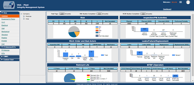
Figure 1 VAIL Plant – Dashboard (APMS)
Best Practices for Creating Effective User-Defined Graphical Charts
Graphs are a great way to visualize data. They can be used in many different ways and can be created using various tools.
The best practice is to make sure that the graph is accurate and precise. It should mirror the data as closely as possible without errors or misinterpretations. If it’s customized and incorporated into the automated system. Make sure the software system is monitored accurately.
Conclusion
VAIL Plant- Asset Performance Management System, proficiently maintains asset performance records to generate effective user-defined graphical charts. Velosi’s customized software aims to carefully understand its client’s needs within the most diverse business market. It is designed following a user-friendly approach to meet your company’s up-to-date requirements.
Please contact us for more information and assistance.